Inspiration
International students studying in New York City take subways in their everyday lives, from commuting between classrooms and residences to hanging out on weekends. While NYC subway navigation system is mature with a long history, it can be difficult to understand and navigate for newly arrived New Yorkers like NYC international students.
As international students, we care about this issue and want to help people with similar concerns. We decided to start from learning about the existing NYC subway navigation system and international students' opinions on the system.
Secondary Research: Mess Map & Literature Review
Initial Mess Map
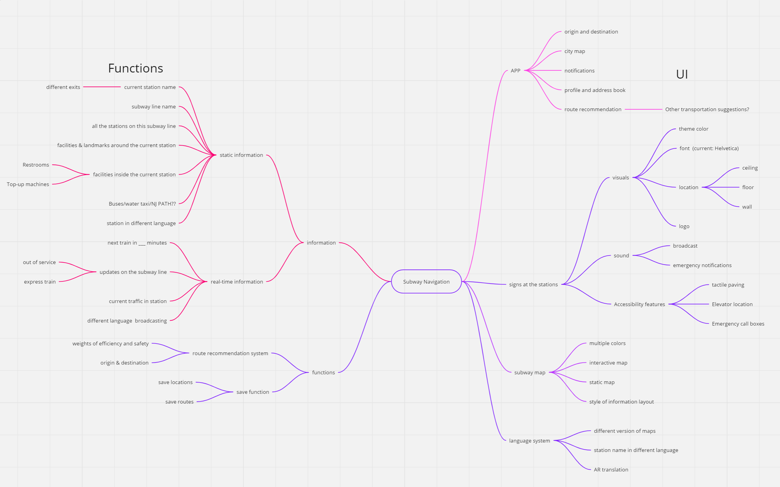
First, we formed a mess map of what we already know about subway navigation.
The left half of the mess map focuses on the functions that we think should be included in a subway navigation system. The right half focuses on the user interface in a subway navigation system, which includes a mobile APP, signs at the stations, and a subway map.
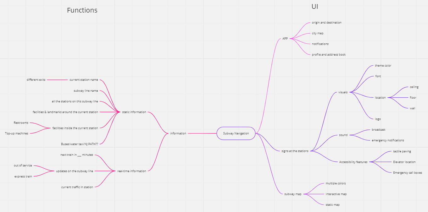
Screenshot of first version of mess map about subway navigation.
From this mess map, we brought up 5 guiding questions for our literature review:
- What are some assistive technologies used in subway navigation systems?
- What are the biggest challenges/problems in subway navigation design in New York?
- Subway navigation systems in other countries/cities that New York can learn from.
- What is the most critical element in navigation of NYC Subway?
- What are our unique value propositions (UVPs)? How can we differentiate from existing subway navigation apps? Ex. Google Maps.
With these 5 questions in mind, we searched for literatures covering borad topics around subway navigation.
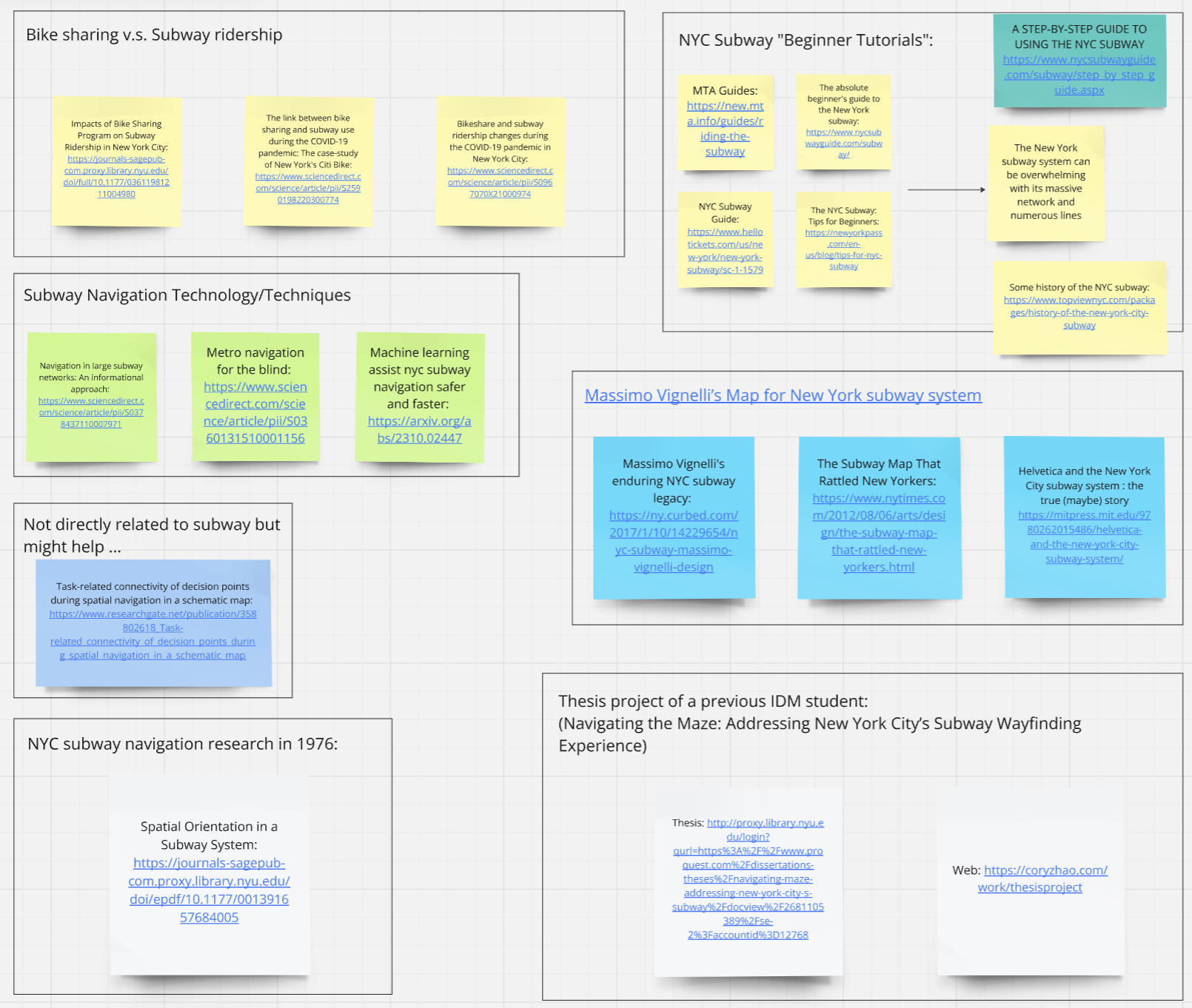
Literature review screenshot 1.
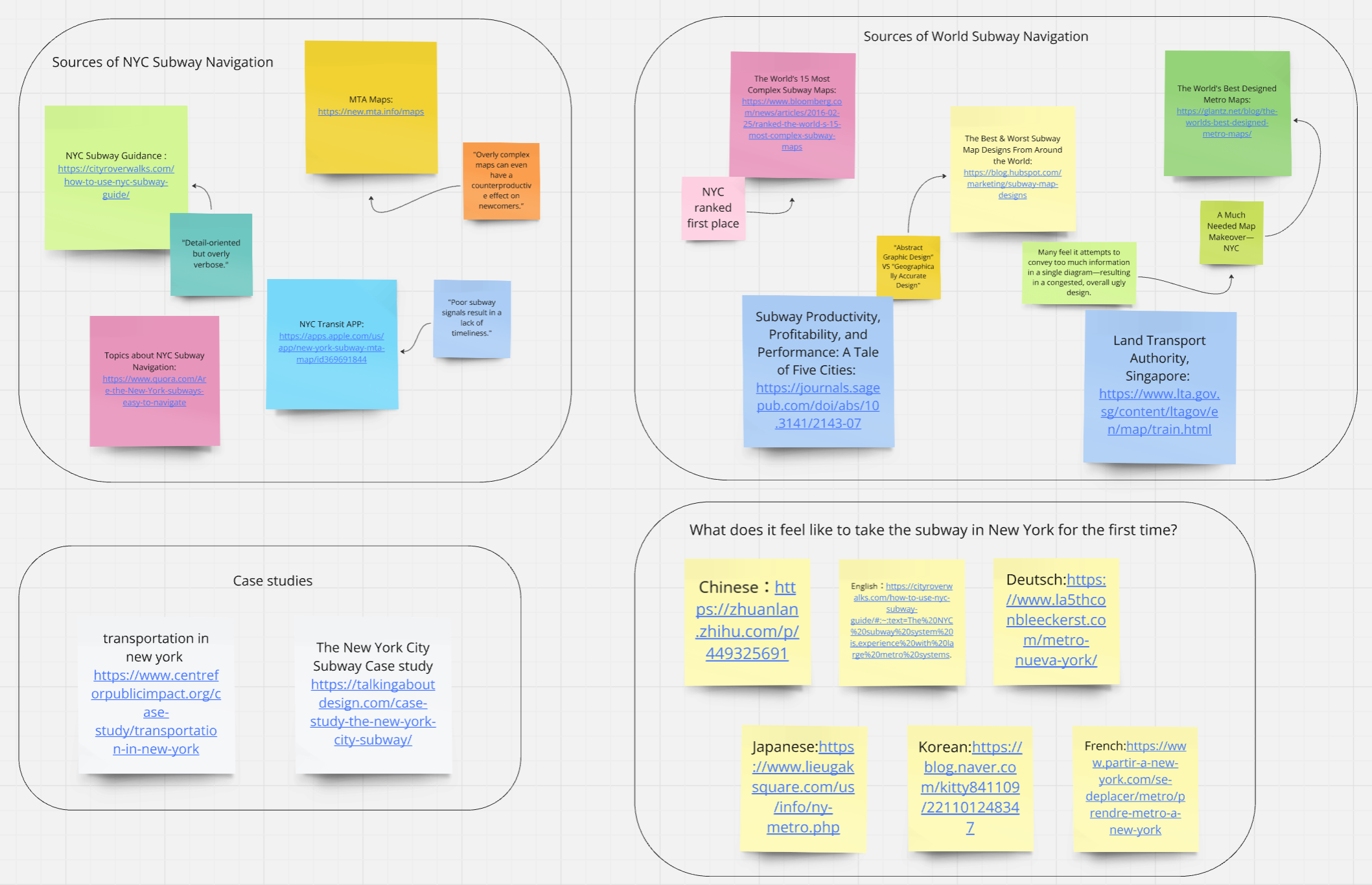
Literature review screenshot 2.
The topics I found interesting are Subway Navigation Technology/Techniques, Massimo Vignelli’s Map for NYC, and the comparison between NYC Subway Singapore Subway. The latter two are more relevant to our later progress, so I listed my findings below.
Massimo Vignelli’s Map for NYC
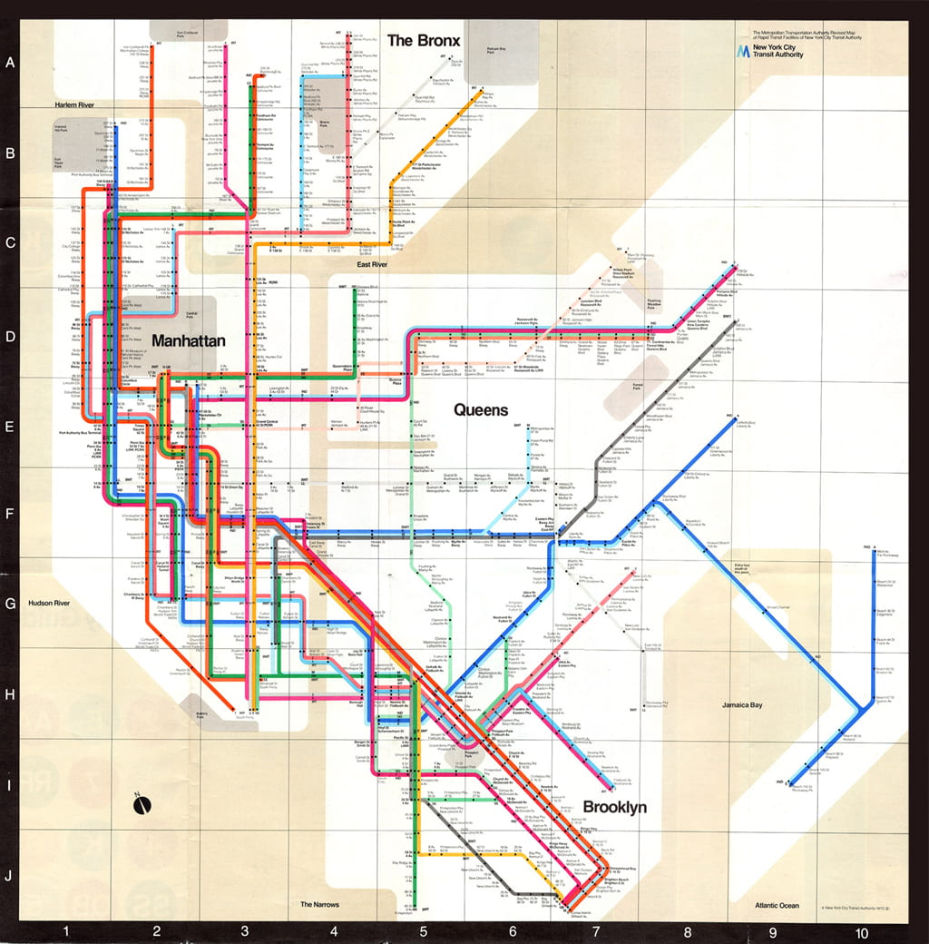
This is another topic I encountered when searching for NYC subway information. Massimo Vignelli was an Italian designer who worked in a number of areas including packaging, houseware, furniture, public signage, and showroom design. He is also the designer of the 1972 New York City Subway map, which was widely rejected by the public once but gradually gained acknowledgment again recently.
Another interesting book is Helvetica and the New York City Subway System by Paul Shaw, which talks about the evolution of subway signage’s visual effects in NYC. I only read the description of the book for now but would like to read more. I think it will help guide our design later if we are designing any form of user interface or graphics for subway navigation.
NYC Subway vs Singapore Subway
I lived in Singapore for years and found its subway system very convenient and efficient for traveling around the city. On the other hand, I’ve only been on the NYC subway three times but found it quite different from Singapore’s subway in many ways. Therefore, I am interested in the comparison between the NYC subway and the Singapore subway due to their various similarities (e.g., the two cities both have a dense population) and the drastic differences between their subway systems.
To learn more about this topic, I found the book named “Subway Productivity, Profitability, and Performance: A Tale of Five Cities”. The book compares NYC with other four Asian cities including Hong Kong, Singapore, and Taipei. I learned from the book that different design choices and governance structures in Asia contribute to higher productivity and reliability compared to New York’s socially conscious and inclusive approach. Moreover, careful analysis is required for fair performance comparisons, but benchmarking offers insights for operational improvement under local constraints.
Revised Mess Map
Based on our secondary research findings, we revised our mess map to include our findings from literature review.
Initial mess map.
Final mess map with more knowledge, including functions and accessibility of subway navigation system and applications.
Stakeholder Map
Before, we thought that an app can solve the subway navigation problem. However, based on our secondary research, most people use powerful Google Maps for subway navigation while still facing difficulties. Therefore, we took a step back to observe the real gaps in user experience.
We started with drawing a stakeholder map.
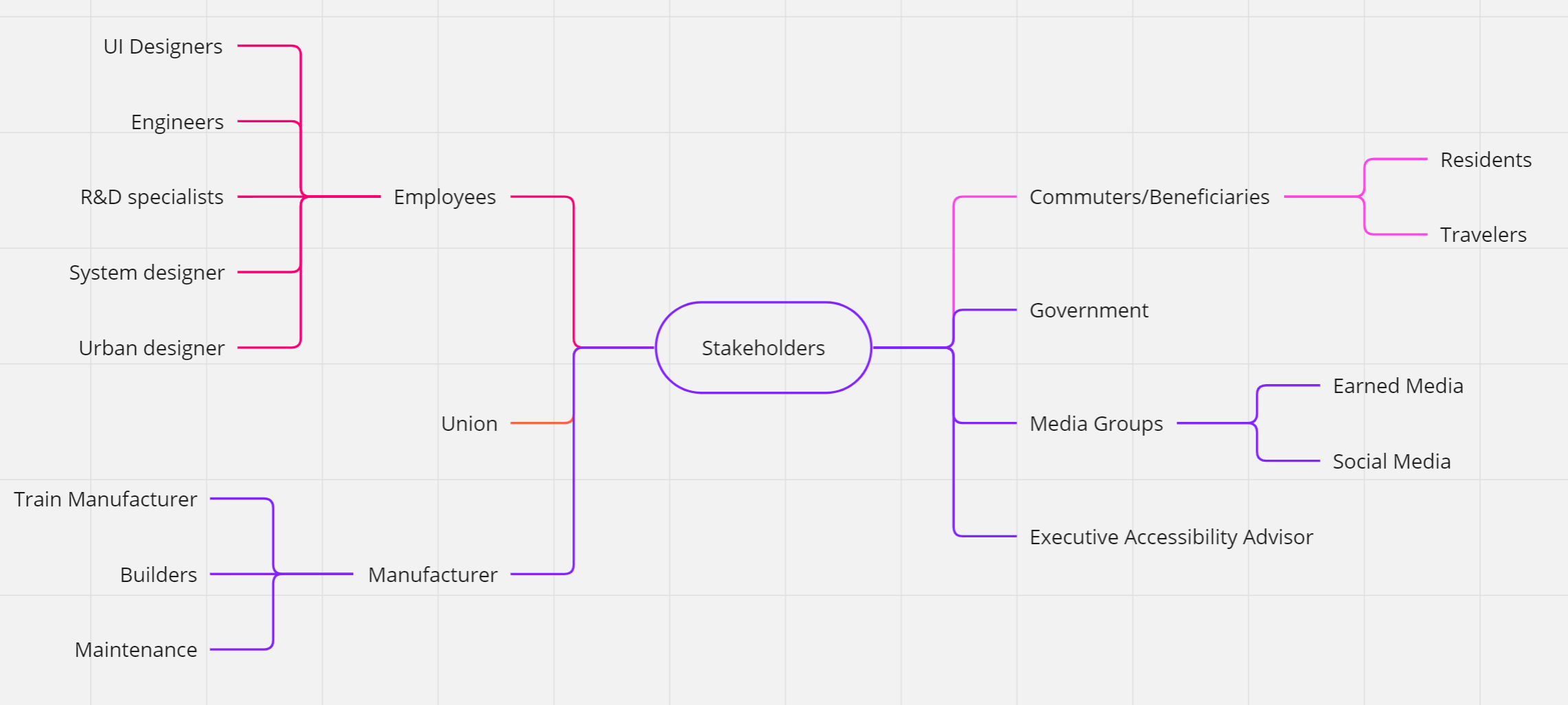
Stakeholder map. We narrowed down our key stakeholders to NYC subway users.
Based on our stakeholder map, we narrowed down our key stakeholders to NYC subway users.
Primary Research
To learn about our target users, we conducted transect tours and interviews. Below are key user insights:
- People would rather rely on Google Maps than look at the signs at the subway stations.However, there is no signal inside most MYC subway stations and navigation software cannot be used.
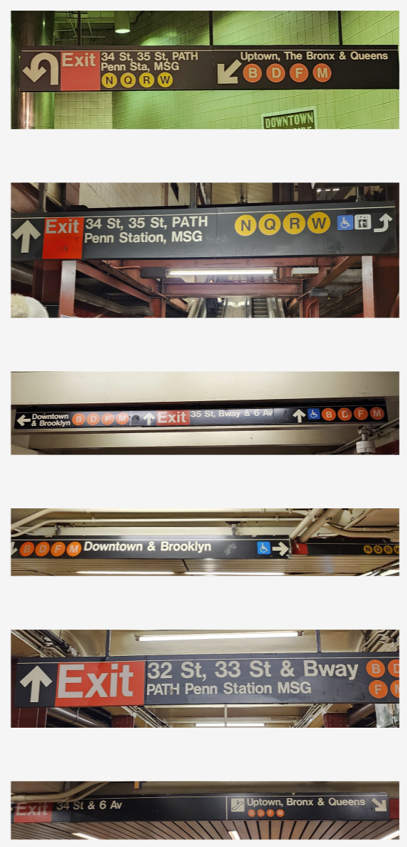
- The current in-station signage can confuse navigation. Especially for foreigners, the NYC subway navigation system is less intuitive compared with the newer systems of other cities or countries.
The NYC subway system is old, complex, and huge with 36 lines and 28 services. Therefore, we think redesigning the NYC subway signage is the most efficient way to improve the system in a short time.
Ideation
User Analysis & Goal Setting
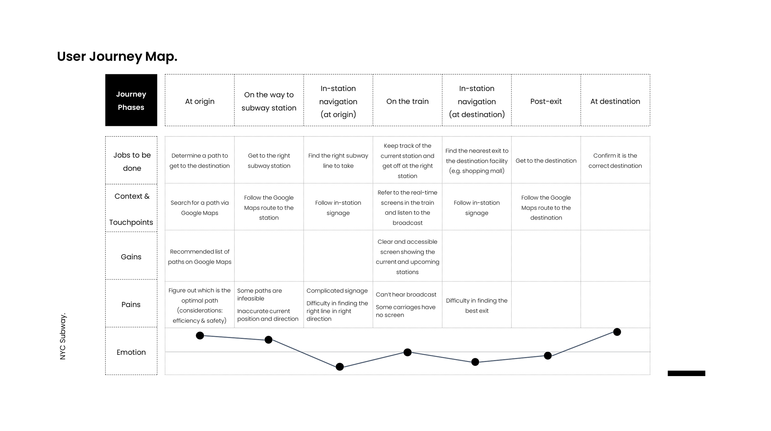
User journey map. We observed that pain points lie in in-station navigation before and after getting on a subway train.
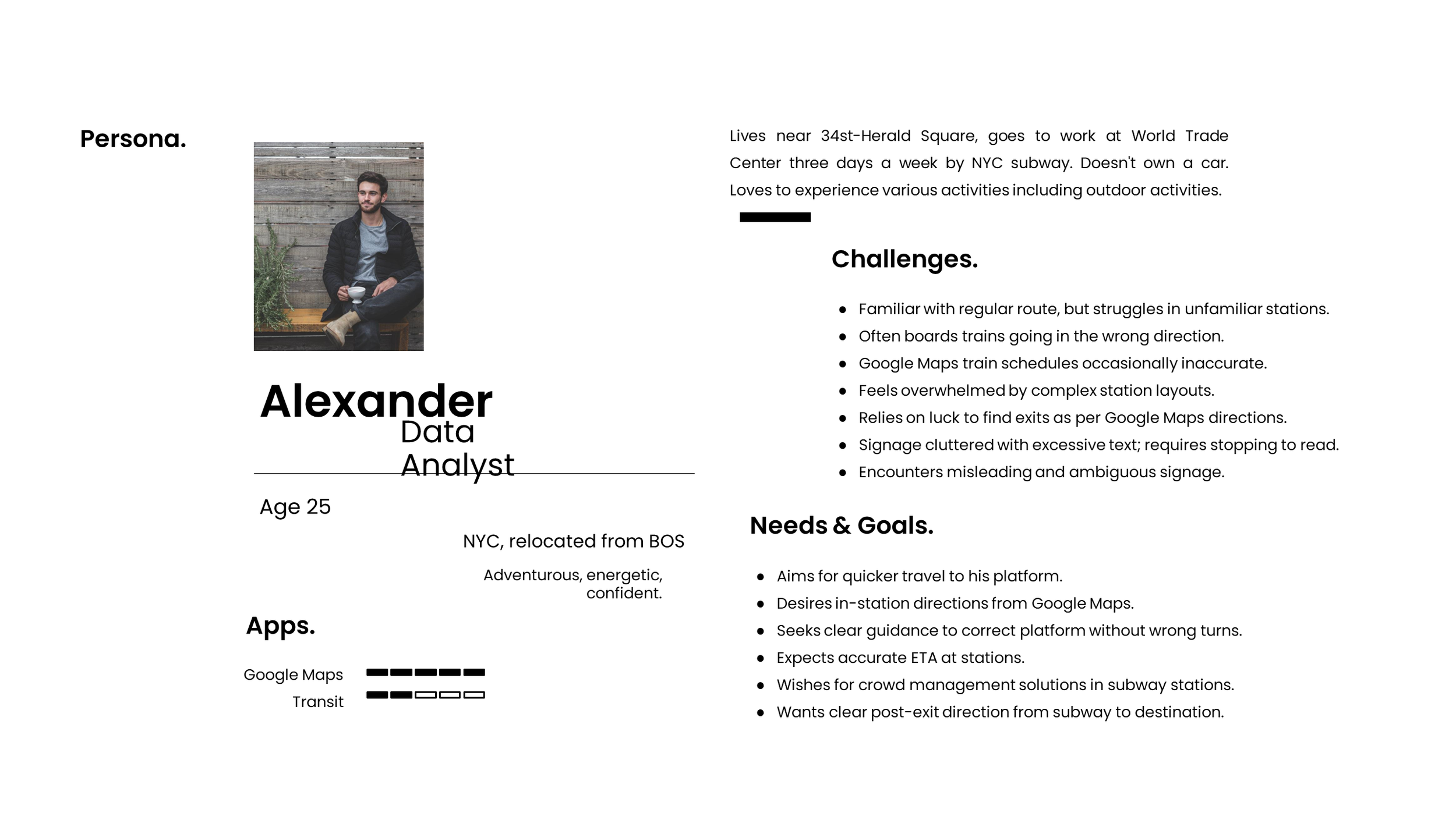
User persona as an anchor for our upcoming design.
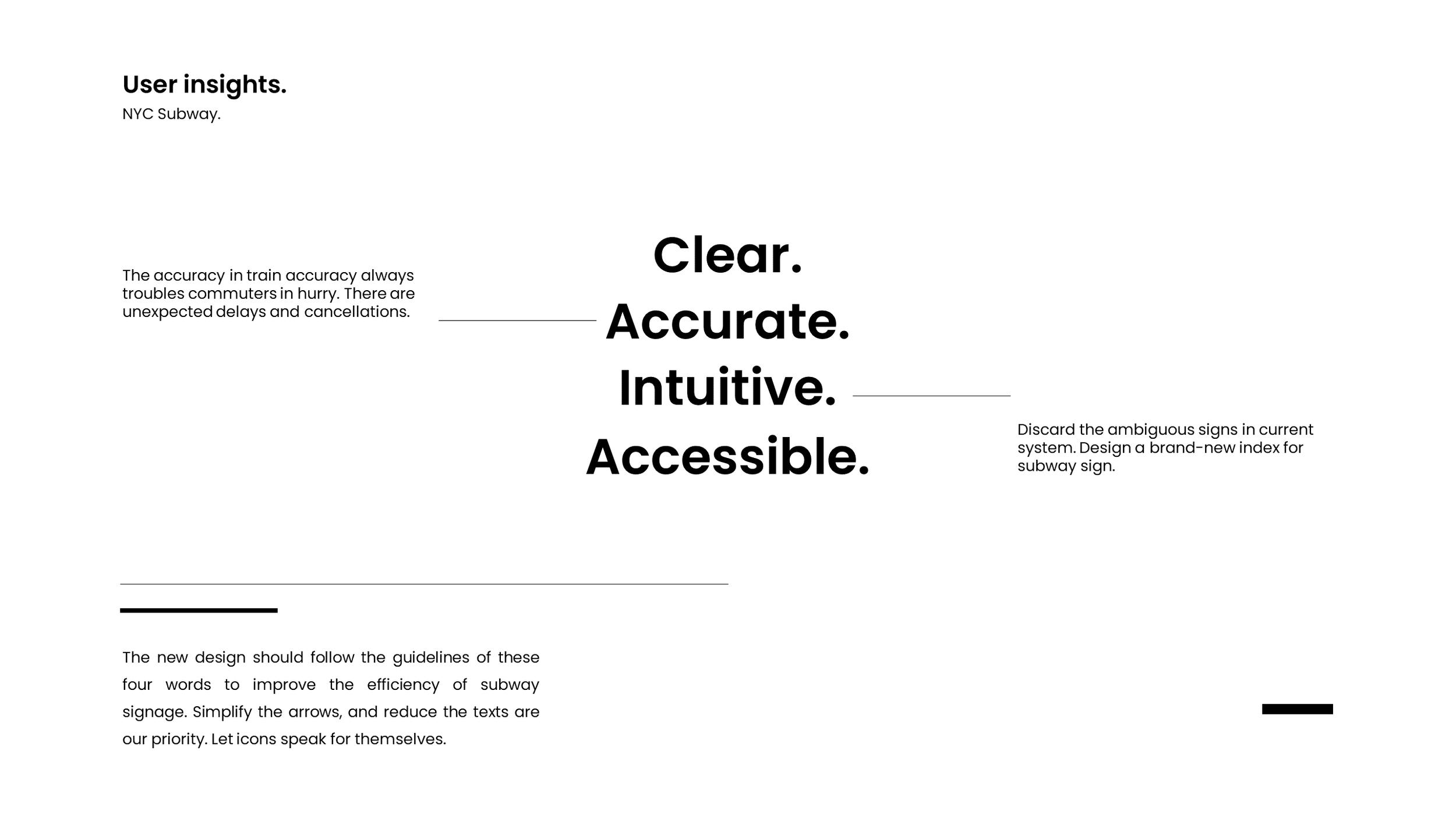
Our design goal. We aimed at creating clear, accurate, intuitive, and accessible in-station navigation for NYC subway users, especially for people unfamiliar with the system.
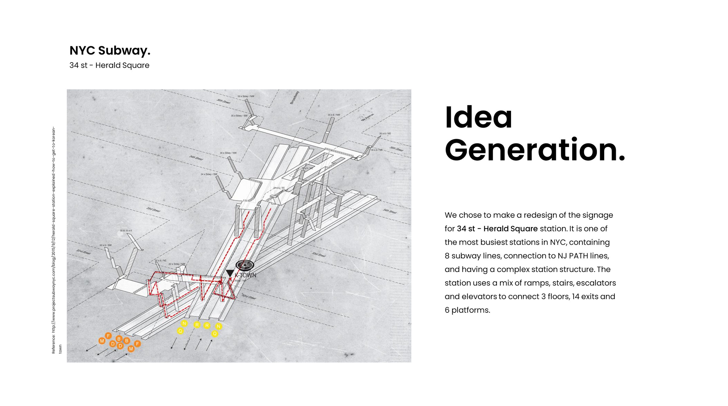
We decided to redesign in-station signage for 34 St - Herald Square station because it is a typically complex station at an intersection of many subway lines,where people tend to get lost.
Production
Prototyping & A/B Tests
Based on our user interviews, we break down a subway navigation journey into 3 key steps:
- Get into the correct subway station.
- Find the correct line and direction to take.
- Get out from the correct exit.
The 2nd and 3rd steps are within our design scope because they are about in-station navigation. To improve the experience in these two steps,we redesigned overhead signs in hallways, LED screens on the trains, and exit signs.
Then, we conducted A/B tests by showing all our designs to NYC subway users. Below are our designs and user feedback.
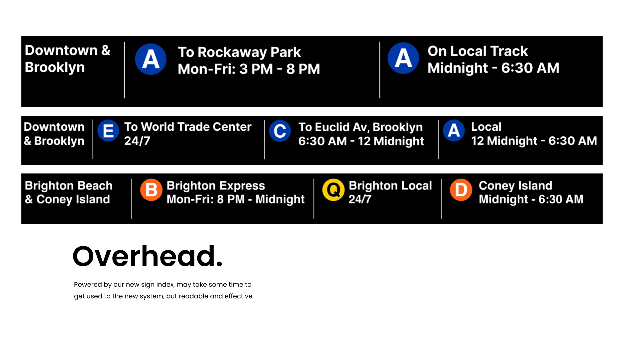
Overhead signs
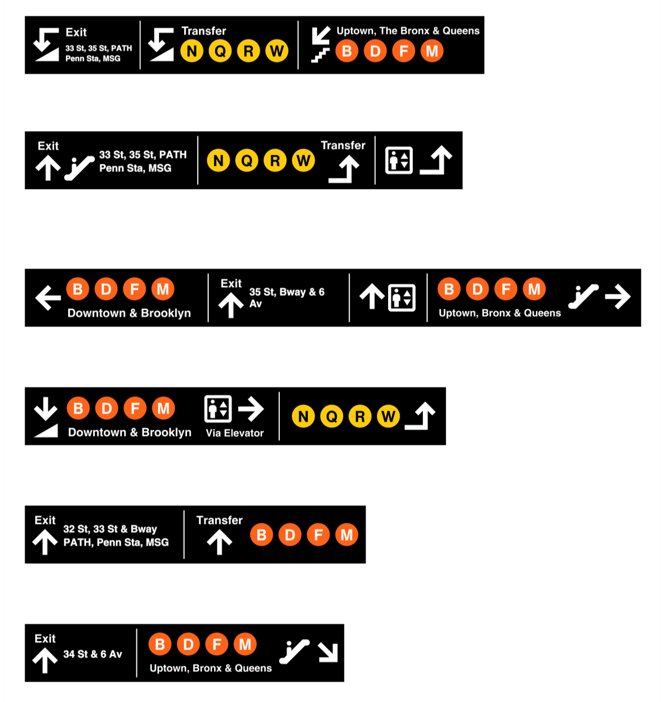
Overhead signs redesign, 1st version. Improvements to overhead signs address two issues: information hierarchy and clarity of directional instructions in complex structures.
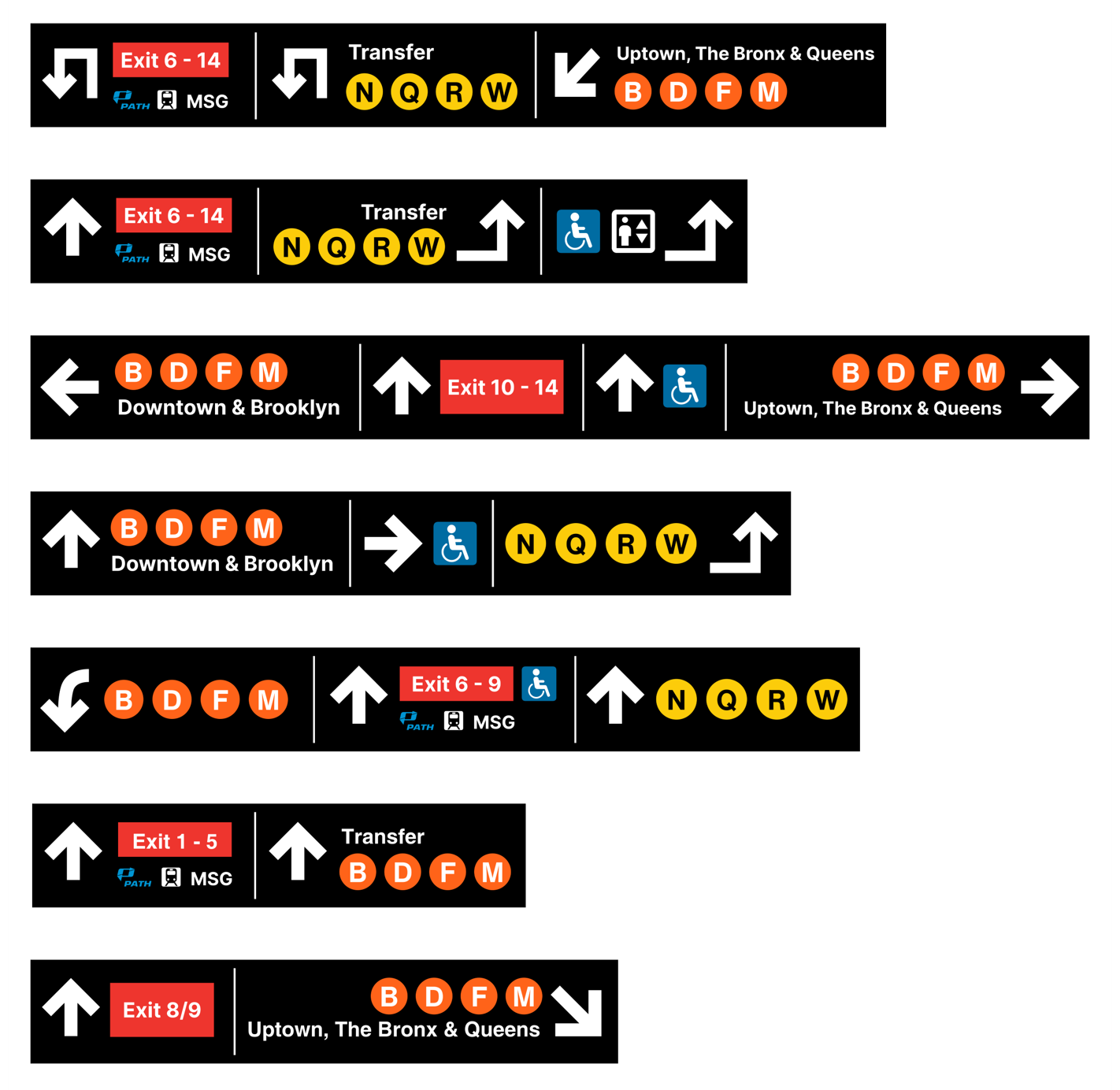
Overhead signs redesign, 2nd version. Another way to mark the exits. The signs have a consistent look because we used our redesigned signage index.
- Version 1 is clearer, version 2 information is a bit overwhelming.
- Preferred information priority: subway lines > directions.
- Exit might be better on an all-red background.
- Users only care about the general direction and don’t expect arrows to give specific directions.
- Users prefer thinner arrows because they make other main information stand out more.
- Users also expressed expectations for a redesign of the overhead signs at the subway platforms.
LED screens on the trains
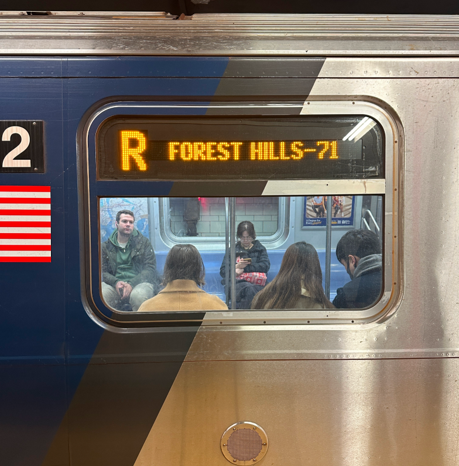
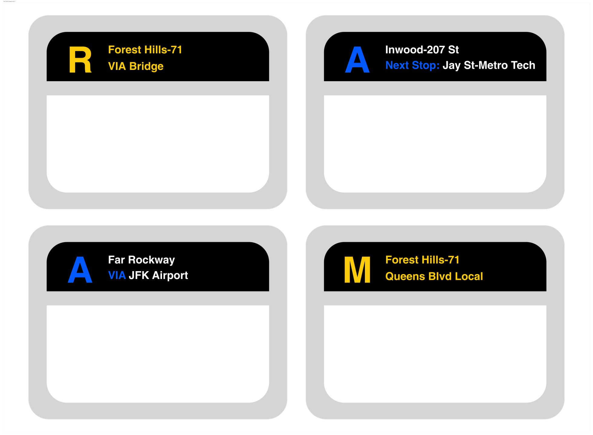
LED signs redesign. We put more information on the origin and destination so that commuters don't need to read the overhead signs when a train has arrived.
Users all preferred our new design over the existing ones. However, some raised questions about the cost of such an update. Therefore, we made an animation of the LED screen to make it look practical and worth the investment.
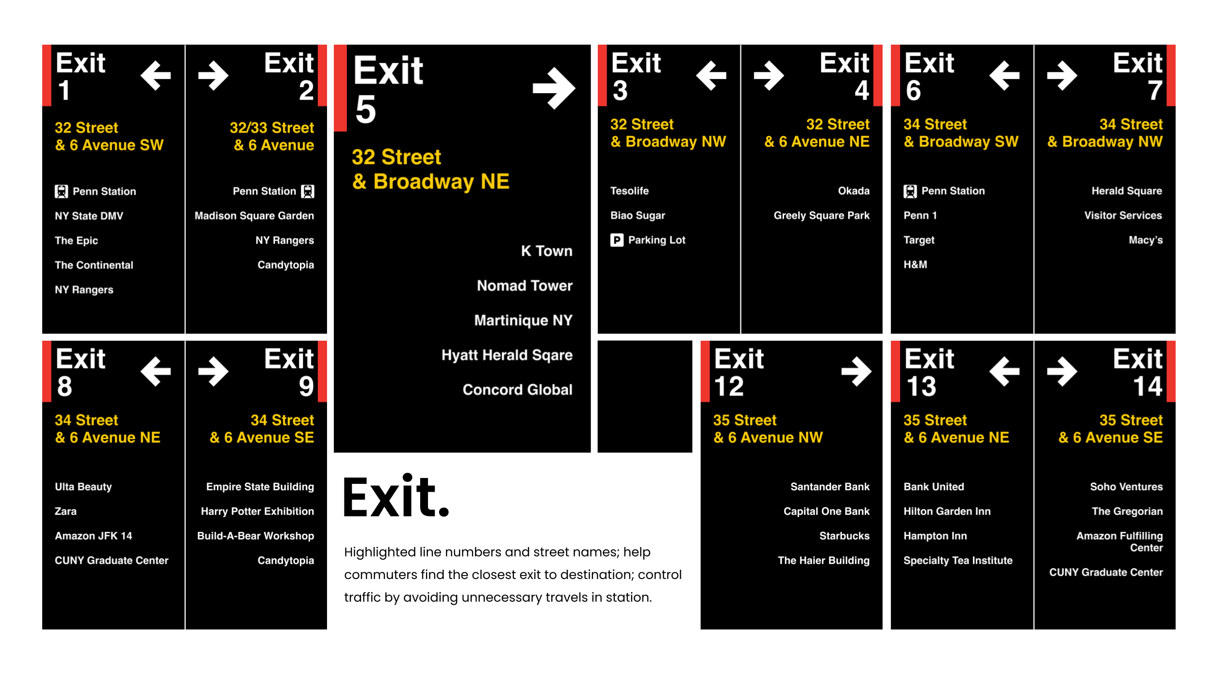
Exit signs
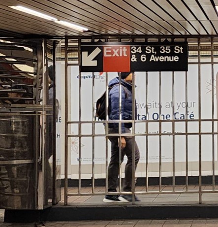
Exit signs redesign, 1st version. Referring to the signage in Chongqing, China, we gave each exit a number (1-14) and labeled it with the current exit name. We also added landmarks and stores near the exit.
Exit signs redesign, 2nd version. We matched the exit sign to the current NYC subway style. We also added icons for nearby parking lots and train stations for more efficient navigation.
- Users like the eye-catching yellow road names in version 1, as well as the numbers and exit written separately.
- Users like the font size in version 2, where the Exit and its number have a much bigger font size than its nearby landmarks. Users also like the icons for train stations and parking lots.
Based on the A/B testing results, we iterated our design to better suits our stakeholders' needs.
Final Deliverables
Redesigned overhead signs part 1.
Redesigned overhead signs part 2.
Redesigned overhead signs part 3.
Redesigned signs at exits.